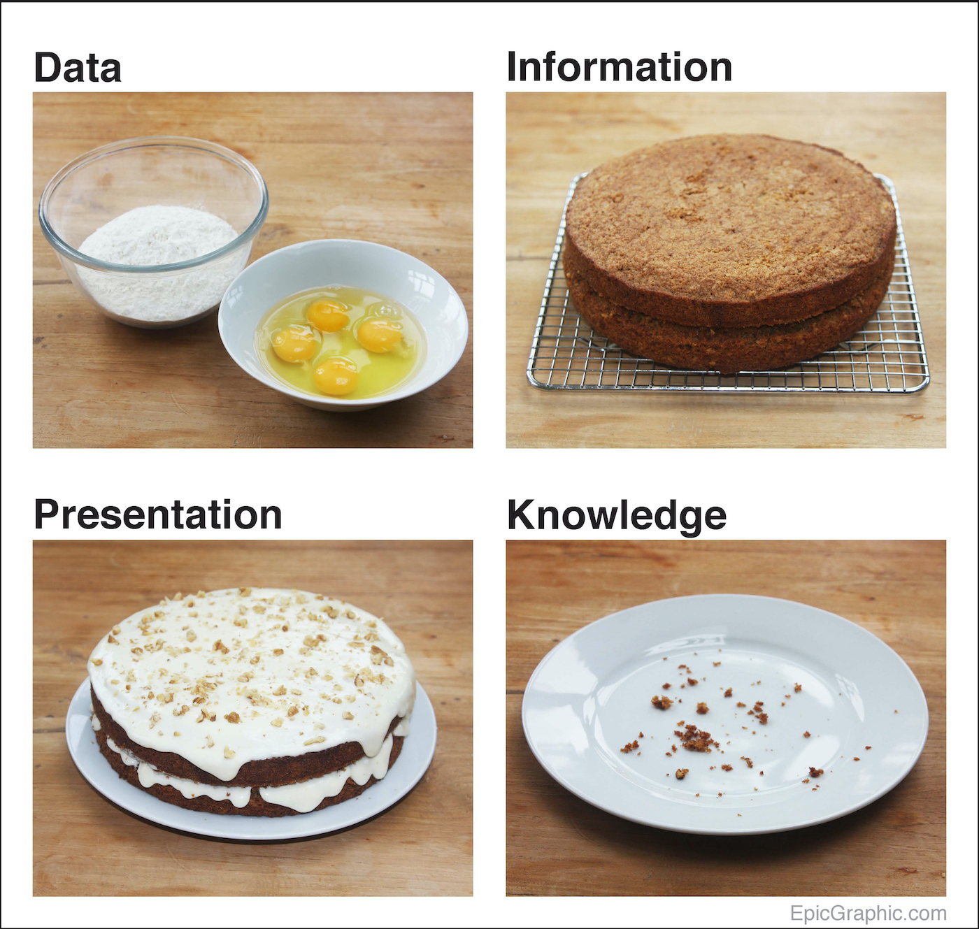
Data Cake
| 192 | Pieces of Coverage |
| 1,290 | Facebook Engagements |
| 581 | Tweets |
A personal project that took on a life of its own
Way, way back… early in my venture into the world of data visualisation, I was trying to work out a process for visualising data, when I stumbled upon a simple four-step framework:
Data -> Information -> Presentation -> Knowledge.
I loved the simplicity.
But I did have a follow-up question:
What’s the difference between data and information?
I mulled this over for a while, then an answer sprang to mind, which led to the creation of this visual metaphor…
This was the first thing I’d ever created that earned attention online.
I remember the day it went live. I got up every hour that night to follow its progress on Twitter. Thankfully, I don’t feel the need to do that any longer, but it was exciting at the time!
My partner didn’t quite share my enthusiasm when I woke her up at 4am to tell her, “It’s got 400 tweets!”
“Shut up and come back to bed,” was the response.
She had a point.
Anyway, this simple metaphor seemed to strike a chord.
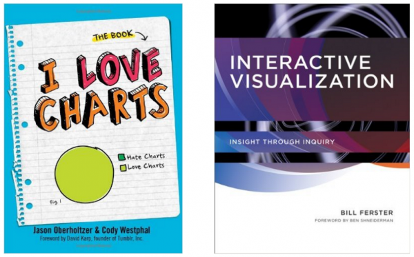
It has been used in presentations inside universities, governments and the OECD. And it went into print twice too – once in the intro section of I Love Charts (the book by the popular Tumblr blog), and again in an MIT textbook on Interactive Visualization.
This was quite a funny outcome for something that took us four hours to make one Sunday afternoon, including baking the cake.
I had my first taste of success.
And I was hooked.
“Great analogy”
Cole Nussbaumer Knaflic, Storytelling with Data