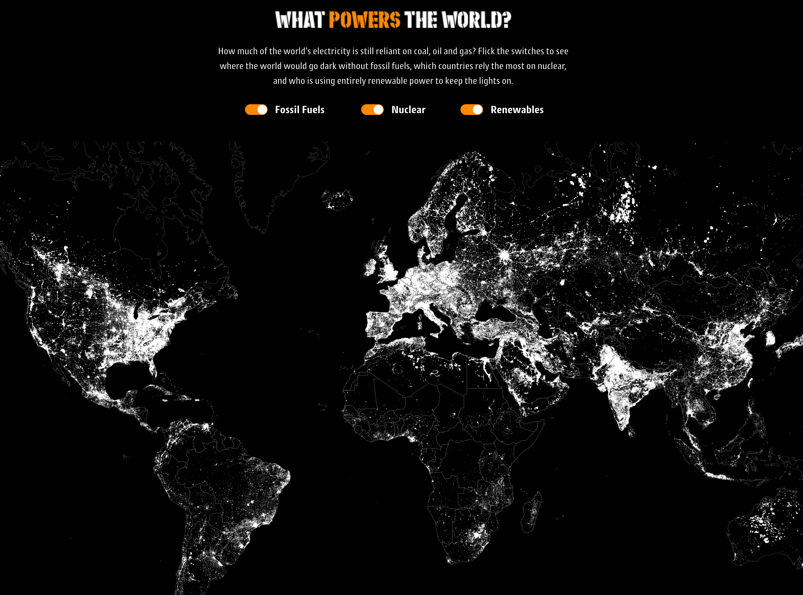
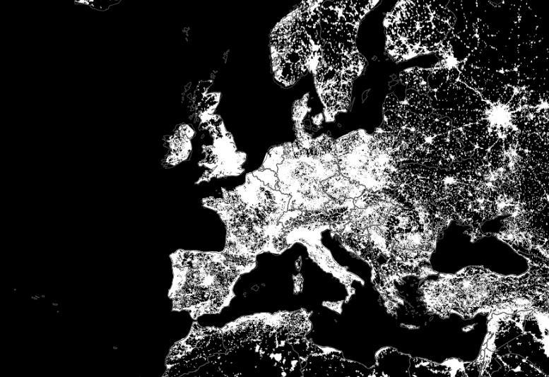
What Powers the World?
| 312 | Pieces of Coverage |
| 471 | Tweets |
| 7,602 | Facebook Engagements |
An enlightening visualisation
The challenge was to create a campaign about choosing energy providers, including the availability of renewable energy plans.
During our research, we discovered an interactive graphic which became the inspiration for what we went on to create.
I wish I could still find the original piece for reference, but I haven’t been able to. In it though, they had had various sliders allowing you to change the percentage of the world’s energy mix.
But the challenge with it was there were too many sliders – one for oil, one for gas, one for coal, etc. And when you dragged the sliders, the visual change happened too gradually for it to be noticeable or impactful.
Instead of dragging down three different sliders, I wanted to be able to hit one switch and see what happened.
What would happen if we turned off fossil fuels today?
What about nuclear?
What if we were only using renewables?
So that’s what we set out to make.
What we added here was simplicity and impact.
The original piece was featured in National Geographic, and the same publication covered our version too, along with 311 others.