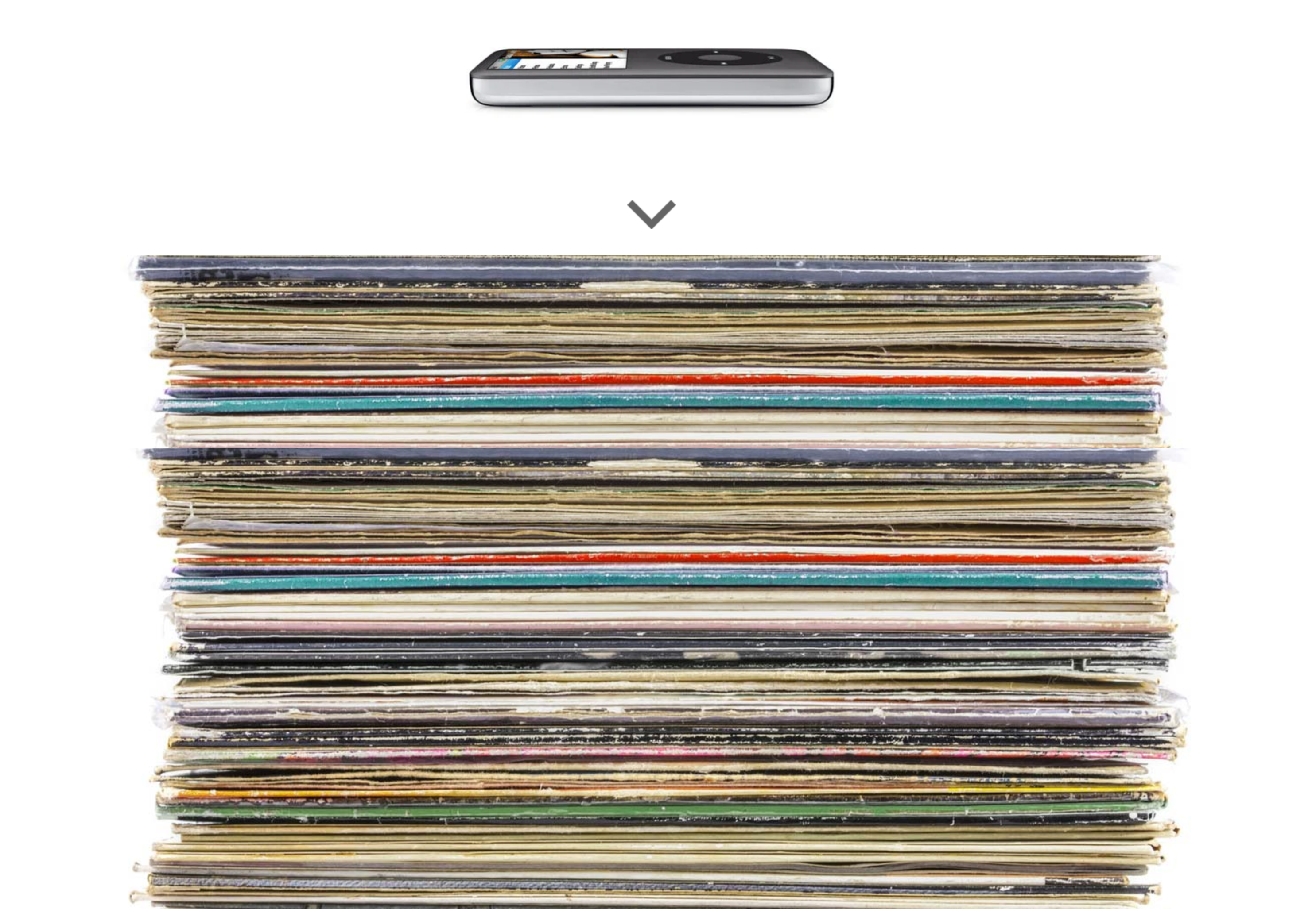
iPod vs Vinyl
| 475 | Pieces of Coverage |
| 27,499 | Facebook Engagements |
| 224,093 | Visits |
Simple and impactful
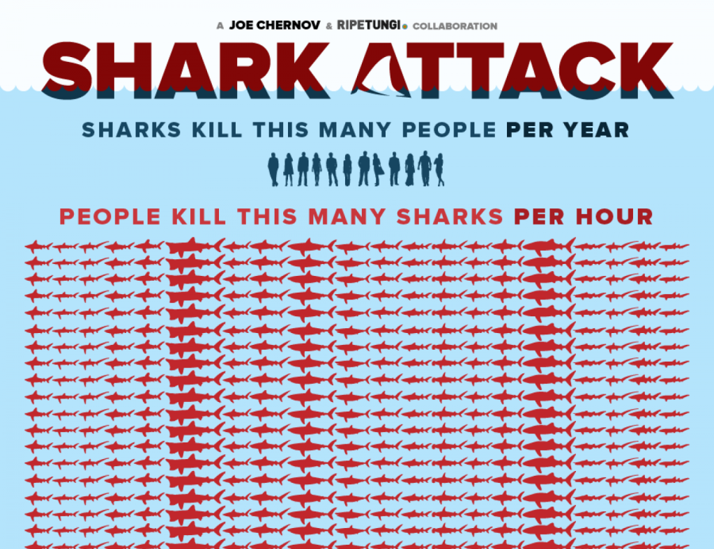
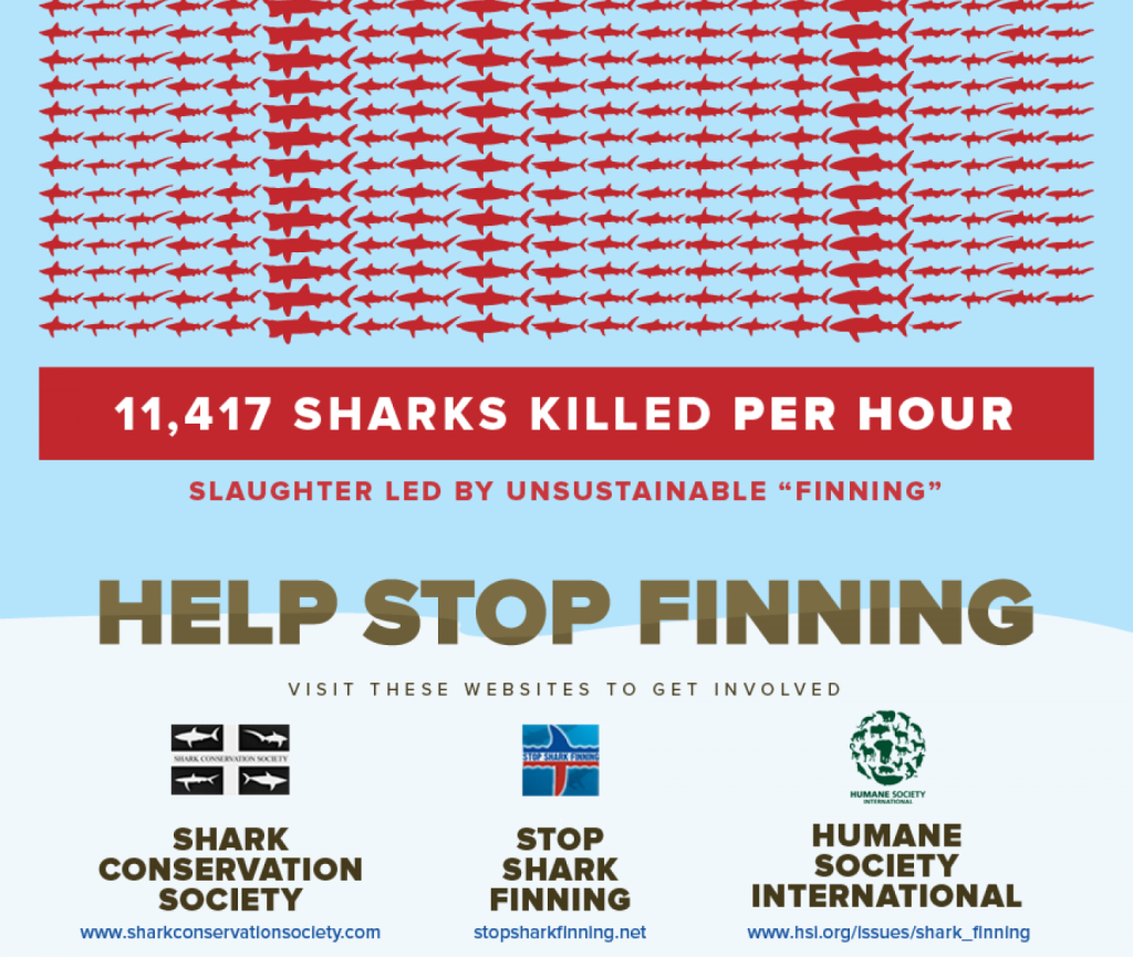
The following might be my favourite static infographic ever: Shark Attack by Ripetungi.
It starts like this…
And it scrolls…
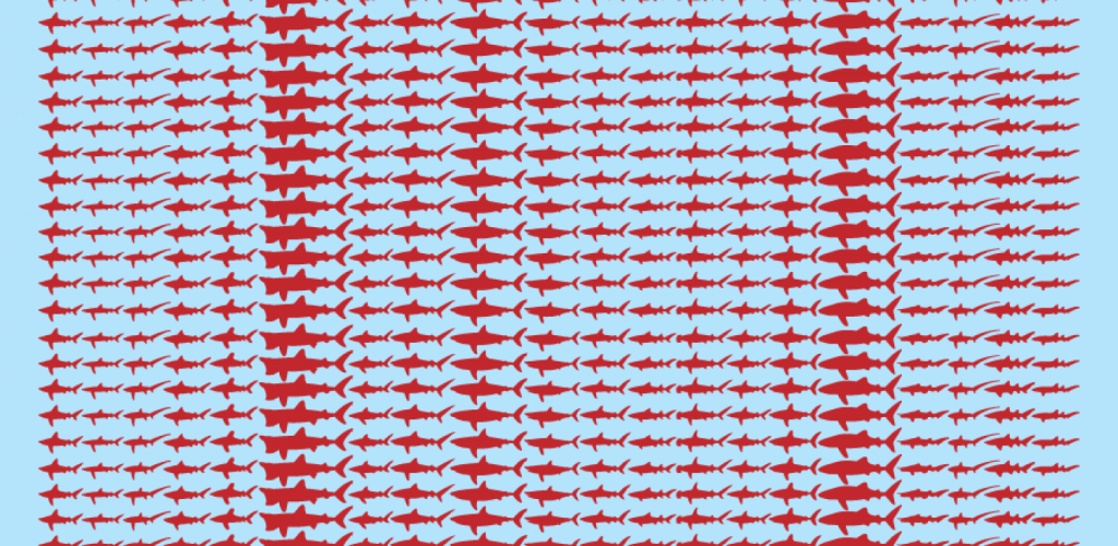
And it scrolls…
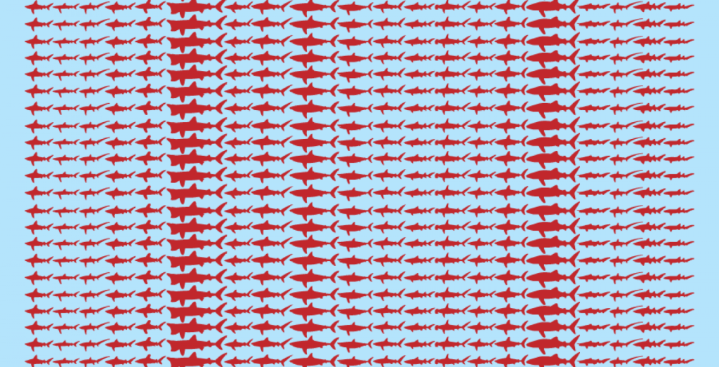
Okay, let’s zoom out to get some perspective…
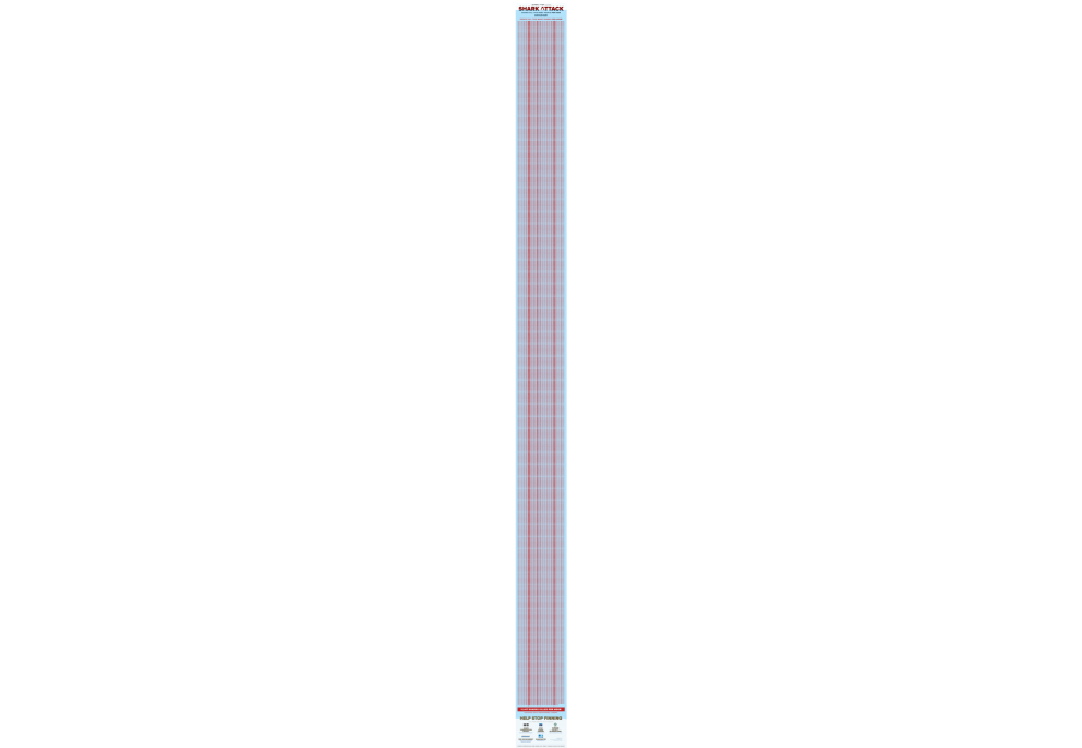
Ooft!
That’s a lot!
When I pull this up in workshops, and start scrolling, at a certain point, members of the audience often let out an involuntary expression – “Ugh!”
It’s stomach turning, really.
But what strikes me about this is that a visualisation can create such a visceral reaction.
Now, I’ll accept it’s a pretty sombre topic, but that’s a powerful piece of communication. And it’s the length of the graphic that makes the point.
While I was working with a client, creating content about music, I turned to my trusty swipe file one day, and the Shark Attack graphic leapt out at me.
I wondered… what could this be in music…?
To help answer that question, I wondered… what is this graphic really doing?
It’s showing two quantities that are comparable to each other… but one of them is small and one of them is really large… So what could that be…in music?
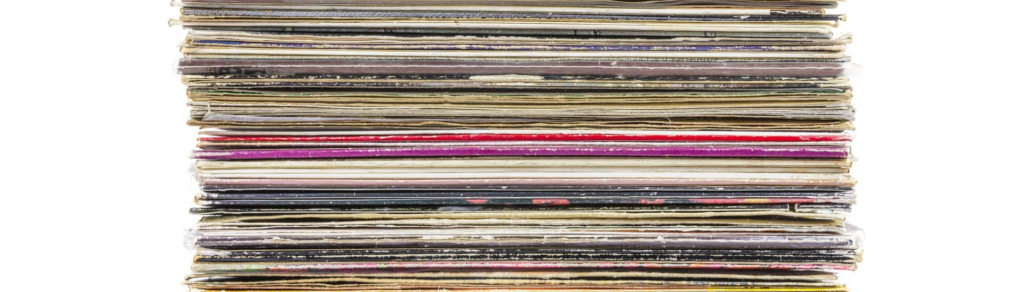
I sat with the question for a while. Then it came to me! How many records can an iPod hold? That could work!
And that’s what we did.
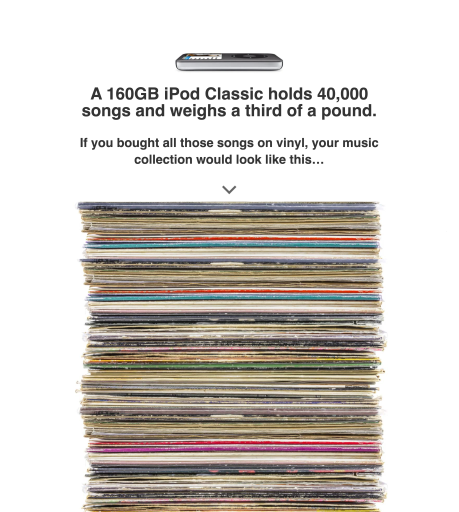
And it scrolls…

And it scrolls…
Actually, we turned the scroll into an automated animation to keep people engaged…
And eventually, FINALLY, after 21 seconds… you land at the bottom.
It was one of the simplest pieces we’d ever created.
But that simplicity felt risky.
You generally want to strive for simplicity, but it’s unnerving when you get there.
Would this be enough? Would people really share this?
It turned out they would.
“Pretty darned cool”
The Mac Observer