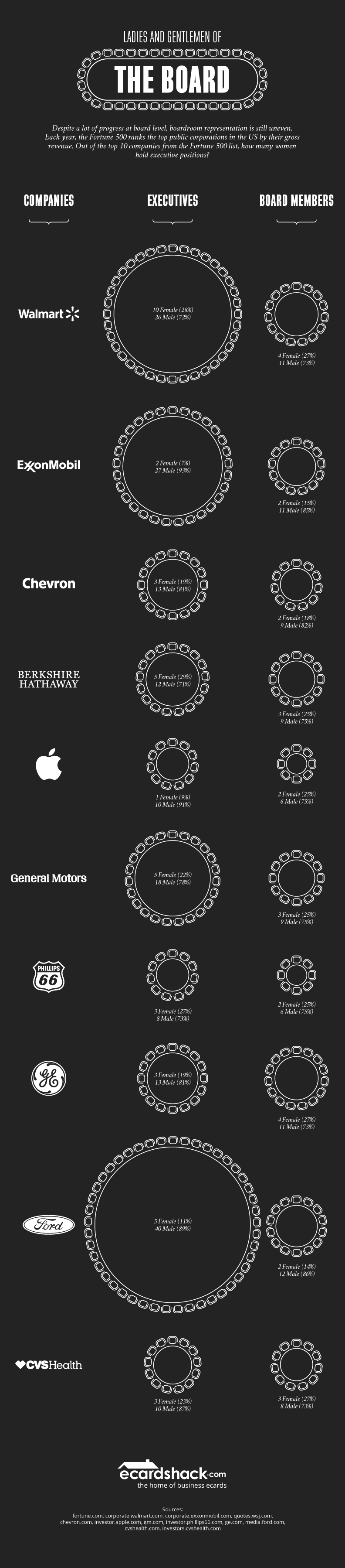
Ladies and Gentlemen of the Board
| 31 | Pieces of Coverage |

The visual take-away
This was an idea the team at Aira had for one of their clients, and I helped them with the visual concept. They wanted to show the gender divide at the board level of the world’s top companies.
Now, that could be shown with pie charts and bar graphs. But how impactful is that really? How emotive?
How could we make this a little more concrete? And what is it we’re talking about really? A seat at the table.
Sometimes it can be impactful to take something away. What happens when you remove all the seats not held by woman? What does the picture look like then?
And sometimes a .gif can give you all the animation you need to make your point. Simple, effective, and engaging.
Want to create better content?
I’d love to help. Get in touch and we can discuss what you’re looking for.