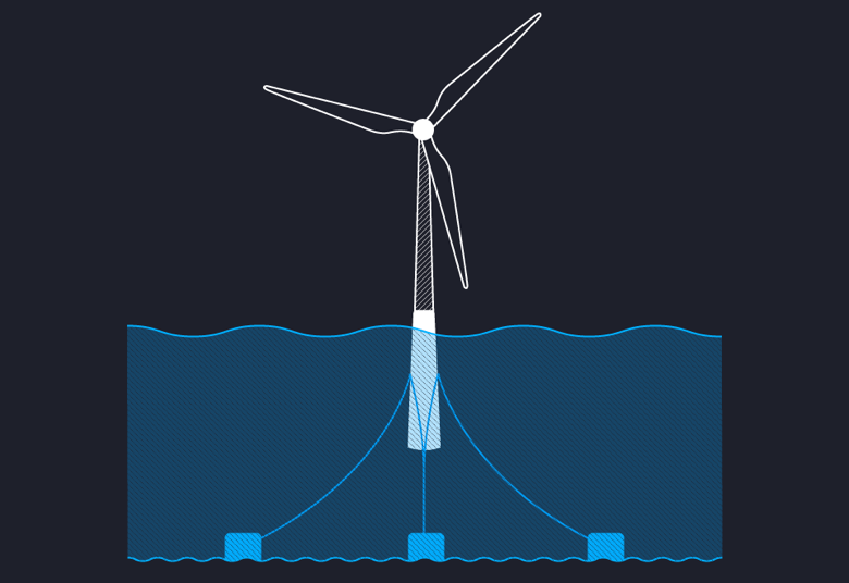
Offshore Wind Farms are Booming
| 45 | Pieces of Coverage |

It can be hard to show why
The communication challenge here was to show how and why offshore wind farms were on the rise. WHY, in particular, can be challenging to show.
Data doesn’t always tell you WHY something is happening. It can show WHAT is happening, and HOW things are changing, but WHY tends to requires further explanation.
And too often, explanatory graphics don’t really contribute to the audience’s understanding. Many of them just make the words and numbers ‘prettier’.
But I’m very passionate about the idea that a good graphic or visualisation can make the information easier to understand. And in this example, even thought it’s a complex topic, you’ll hopefully find the visuals and the layout help make things clearer.
But I’ll have to leave that for you to decide.

