Turning a Profit
| 1,261 | Pieces of Coverage |
| 21,818 | Social Shares |
Head-spinning numbers
The client, WorldPay Zinc, provided a payment processor to help speed up business transactions.
When thinking about businesses making money, one dataset sprang to mind: the Fortune 500.
This was early on in my career, and the challenge we ran up against here helped inform my thinking and the processes I follow today.
The original idea we pitched to the client was ‘The Fortune 500 Visualised: The rise and fall of the world’s greatest companies.’
This sounded like a good idea to me, and my colleagues and the client agreed. We were all on board.
But midway through production, it ground to a halt. We were staring at a mess of line graphs, trying to pull out the story. But it just wasn’t clear what we wanted to show. Some companies had gone up, some had gone down, but ultimately, what was the point?
We needed to go back to the drawing board.
This involved my colleague Luke and I staring at the Fortune 500 and other datasets for days (and I mean DAYS!!!) trying to pull out something we could go forward with. Until, finally, Luke came up with the idea of showing how quickly different companies made money. And that’s what we went with.
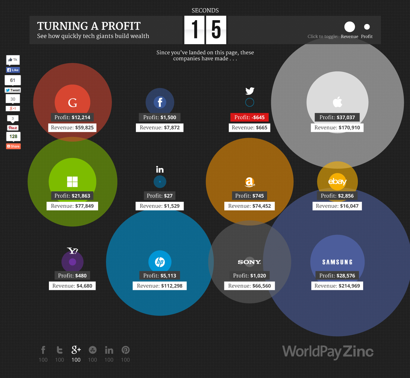
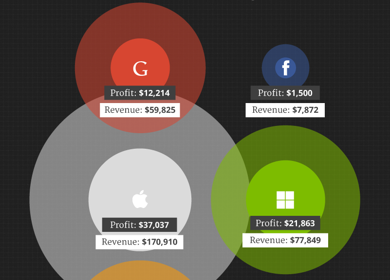
From the moment you arrived on the page, the second timer began, and the bubbles started growing, showing how much money (in revenue and profit) the top tech firms had made since you landed on the site.
In the screenshot below, we’ve paused the graphic after 15 seconds. In that time Apple had made $170,000 in revenue and £37,000 profit, while Samsung had made more revenue but less profit. Amazon was making more revenue than eBay but less profit overall. And Twitter was just racking up losses.
And you can easily make other comparisons, as well as seeing how quickly these businesses are making money.