Data Cake
| 192 | Pieces of Coverage |
| 1,290 | Facebook Engagements |
| 581 | Tweets |

A personal project that took on a life of its own
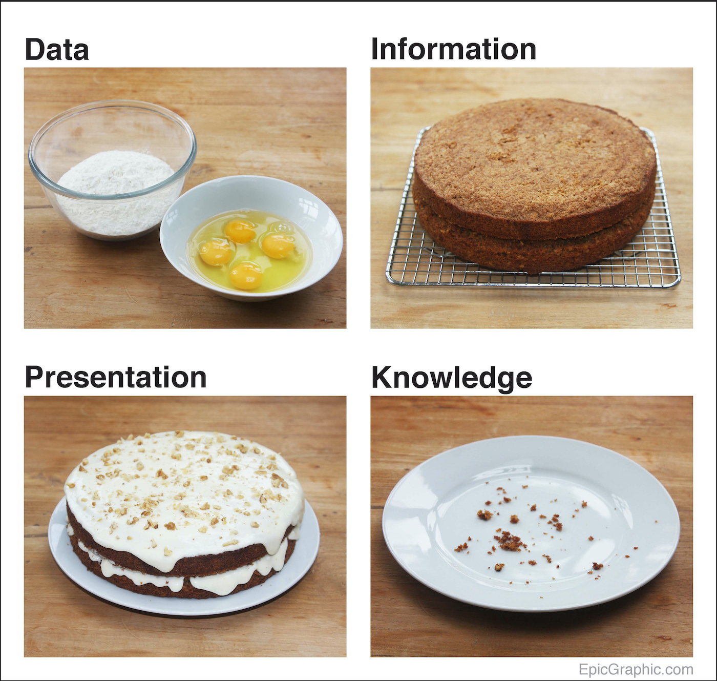
Way, way back… early in my venture into the world of data visualisation, I was trying to work out a process for visualising data. As part of this, I was wondering ‘What’s the difference between data and information?’
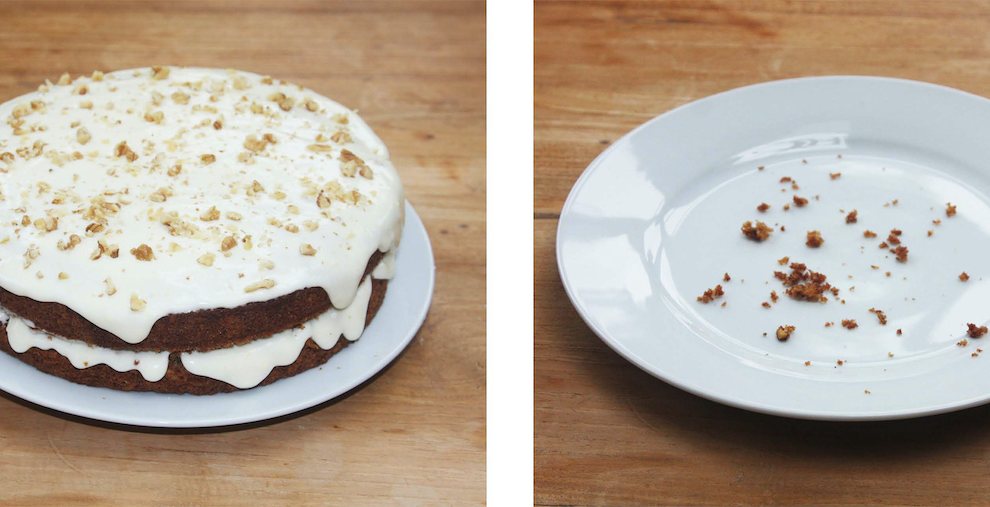
A simple metaphor came to mind.

This was the first thing I ever created that gained attention online.
I remember the day it went live — I got up every hour that night to follow its progress on Twitter. Thankfully, I don’t feel the need to do that any longer, but it was exciting at the time.
My partner didn’t quite share my enthusiasm, however, when I woke her up at 4am to tell her, “It’s got 400 tweets!”
The metaphor seemed to strike a chord.
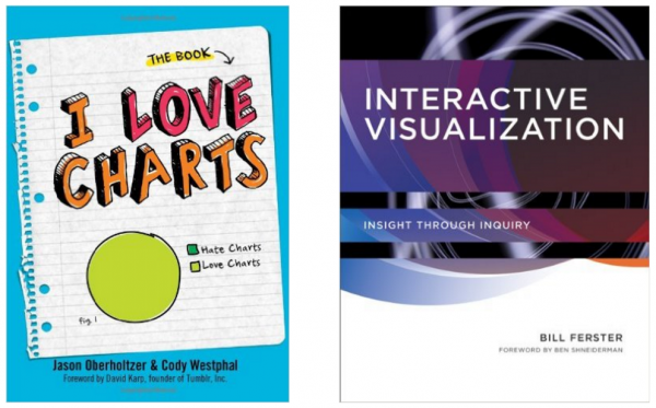
It has been used in presentations inside universities, government organisations and the OECD. And it went into print twice – once in the intro section of I Love Charts (the book by the popular Tumblr blog), and an MIT textbook on Interactive Visualization.
This was quite an amusing outcome for something that took four hours to make one Sunday afternoon, including baking the cake.
I’d had my first taste of success. And I was hooked.
“Great analogy”
Cole Nussbaumer Knaflic, Storytelling with Data

