The Robots Are Coming
| 73 | Pieces of Coverage |
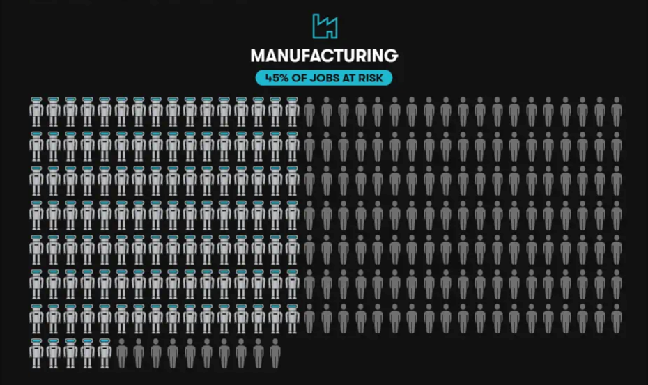
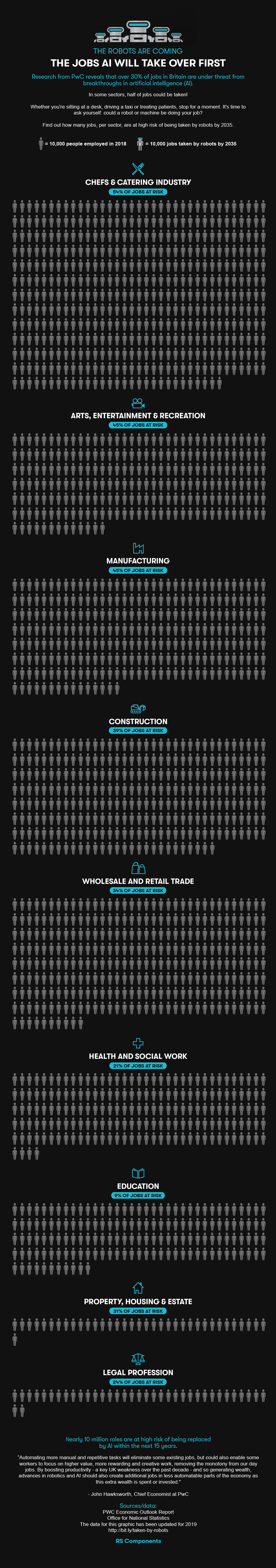
Bringing the stats to life
My role in this piece was purely consulting on the visual execution. The challenge was to show the proportion of jobs that could be taken over by A.I.
If we presented this in bar graphs or pie charts, it wouldn’t be very emotive. They would just look like abstract statistics and graphs. But these were people’s jobs! Being taken over!
It needed something more.
Whenever the visual execution isn’t quite working, I typically ask myself “What EXACTLY do we want this to show?” The answer in this case was we wanted to show the NUMBER of PEOPLE whose jobs could be TAKEN OVER by A.I.
The number of PEOPLE is important here. Turning statistics into portions of a pie chart can lose site of the fact we’re talking about people. So instead, we decided to show 100 people for each job category, making it more human, concrete, and emotive.
Then there’s the ‘TAKEN OVER’ part. That’s where where we had the idea of visually showing how many people could have their jobs ‘taken over’ by a robot, with the people in the graphic being replaced by robots in a simple animation.
And what’s the simplest way to show the robots taking over? In a .gif
I often think .gifs are a little underused and underrated in data visualisation. They’re such a quick and easy way to introduce some animation, which when used for the right reason, can have considerable impact for such a small investment.